

Case study · Emplojd
Product & UX Design
Helping job seekers apply with confidence, without losing their voice to generic AI.
Background
Job hunting often means repeating the same effort across dozens of listings: tweaking CVs, rewriting cover letters, and second-guessing tone. Many candidates burn out or fall back on copy-paste applications that recruiters recognise instantly.
Emplojd explores how AI can shorten the boring parts of applying while keeping recommendations and drafts anchored in what each person actually cares about. The product combines job discovery with assistance for tailored cover letters: always editable, never a black box.
The work ran as part of Chas Challenge 2024, an eight-week cross-disciplinary sprint with a brief centred on AI, from problem framing to a tested, presentable prototype.
How might we use AI to speed up job applications without making every cover letter sound the same?
My role
Lead UX/UI designer: discovery workshops, research synthesis, information architecture, interaction design, a lightweight design system, prototyping, usability testing, and handoff with frontend developers. I collaborated daily with engineering and kept the team aligned through critiques and structured checkpoints.
8 weeks
Chas Challenge sprint from kickoff to showcase
6
Designers & developers in the core team
15+
Research & usability rounds (moderated + async)
3
Product pillars: discover, draft, refine
Role
Tools
Timeline
Context
Collaboration
Research
Discovery before design
Applicant interviews
Mapped pains across the application journey with interviews and lightweight surveys: where time disappears, what feels impersonal, and when people abandon a listing.
A clear pattern emerged: candidates want speed, but not at the cost of sounding like everyone else.
Competitor & landscape review
Reviewed job boards, AI writing tools, and application assistants to see what felt helpful, what felt spammy, and where discovery and document creation were stitched together awkwardly.
Many products optimised for output volume, not for trust or editability.
Workshops & alignment
Facilitated kickoff workshops (Crazy 8s, storyboarding) so design, engineering, and stakeholders shared the same problem frame before screen work piled up.
We agreed early on who v1 optimises for: time-starved applicants who still want believable, personal outreach.
Process
UX approach
Flows & structure
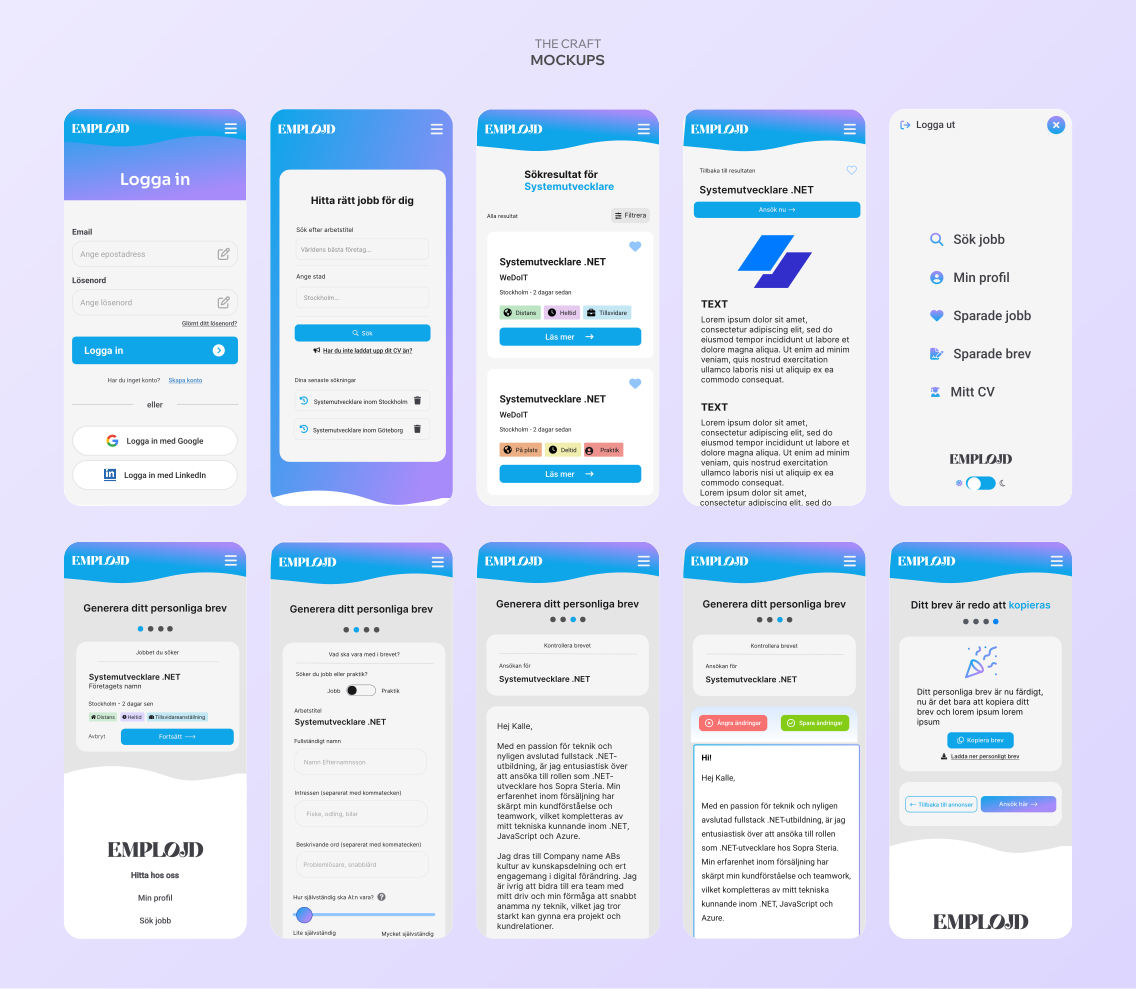
Consolidated flows for onboarding, job discovery, cover-letter drafting, and revisions, with a narrative that keeps users in control of edits and tone.
Paths for find roles, save, and draft a letter for this listing read as three honest steps, not buried shortcuts.
System & craft
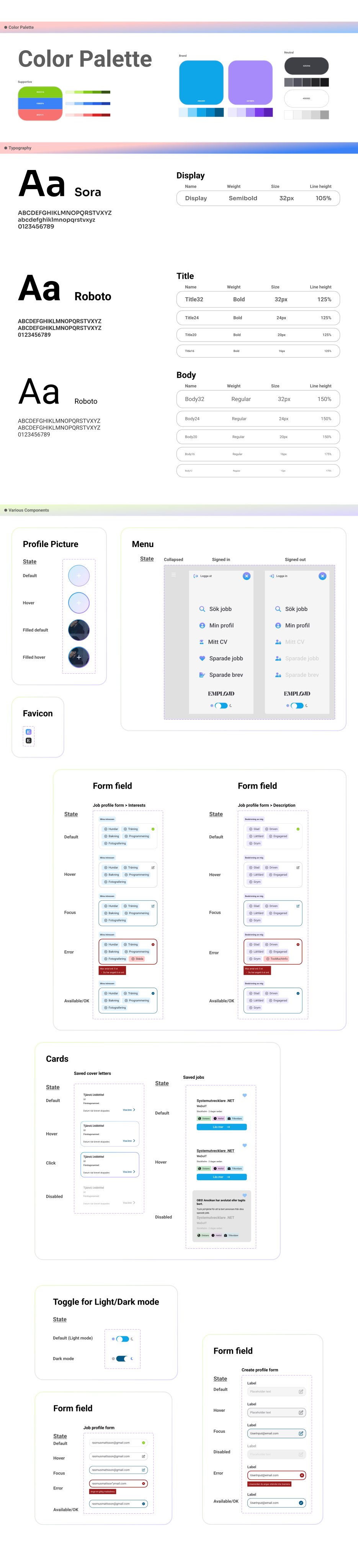
Moved from wireframes into a compact UI kit so developers could implement consistently without endless one-offs.
Typography, spacing, and form patterns were locked early; new components only when a screen proved the need.
Test & handoff
Ran moderated sessions on clickable prototypes; tightened copy, empty states, and error paths where hesitation showed up.
Documented component behaviour and edge cases so the build stayed faithful to intent after the course deadline.
Challenges
What made this hard
AI trust, not magic
Applicants were curious about AI help but wary of generic drafts. One-tap automation demos impressed in meetings and failed in testing.
The product had to show sources, allow edits, and make tone adjustments obvious, not hide them behind a single generate button.
Eight weeks, full scope
Chas Challenge compressed research, IA, visual design, prototyping, testing, and presentation into two months with a cross-functional student team.
Scope discipline mattered: we could not explore every AI feature idea and still ship something testable.
Search vs swipe
Early concepts leaned on swipe-style browsing. Testing showed many users arrived with intent: role, city, remote.
Balancing exploration with structured search meant revisiting IA more than once before the team felt aligned.
Process
What I did
01
Grounding the team
Kickoff workshop & problem framing
Facilitated early sessions to surface assumptions about recruiters, candidates, and acceptable use of AI. Sticky-note chaos became a concise problem statement the whole squad could reference daily.
Key decision
Translated workshop outputs into jobs-to-be-done and explicit non-goals for v1 before visual exploration spread.
Why: Without a shared frame, AI features balloon fast; the team needed a filter for what belonged in the first prototype.
02
From swipe-first to search-first
Information architecture
Iterated IA until discover, save, and draft a letter for this listing felt like one coherent journey, with no dark-pattern shortcuts.
Key decision
Kept search and structured filters primary; treated swipe-style browsing as secondary exploration.
Why: Participants with intent (title, location, remote) fatigued on swipe-only patterns before seeing strong matches.
03
Design system in miniature
UI kit & core screens
Established core components and applied them across flows so critique stayed about semantics and trust, not one-off pixels.
Key decision
Locked navigation, cards, forms, and AI-assisted panels early; expanded the kit only when new screens proved gaps.
Why: A short runway meant rework was expensive; a tight system kept mobile layouts predictable for engineering.
04
Evidence before polish
Testing & handoff
Consolidated findings into playback decks for the team and a pragmatic handoff: states, validation rules, and breakpoints that survived first implementation.
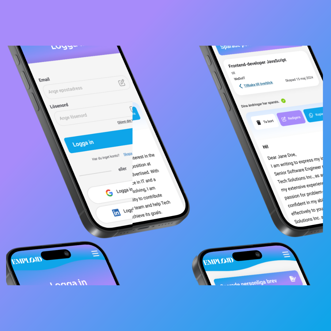
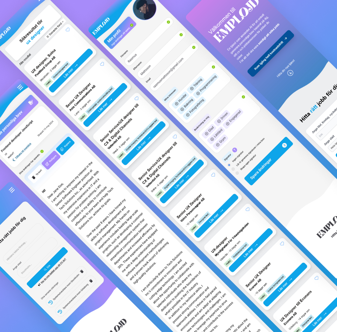
Interactive prototypes focused on the flows we tested most: cover-letter generation, saved letters, and profile setup. Click the active phone to pause; click a side device to swap flows.
Cover Letter Generation Flow
1 of 3



Cover Letter Generation Flow
1 of 3
Key decision
Favoured traceable AI suggestions with clear sources and editable output over maximal automation.
Why: Participants trusted assistance more when they could adjust tone and see why a job was recommended.
“The strongest iterations came when we treated AI as scaffolding, not the applicant's voice. That constraint made the product feel ethical and still useful.”
Insights
What the research revealed
- 01
Applicants decide on trust before they use AI. Editable drafts and visible reasoning beat one-click generation.
- 02
Job search works best when intent is honoured. Filters and search beat infinite swipe for most participants.
- 03
Workshops earn alignment fast, but only when outputs become artefacts the whole team uses the next morning.
- 04
Empty states and error copy matter as much as happy paths. Hesitation showed up where the product felt vague about next steps.
Takeaways
What I learned
- 01
AI features live or die on trust. Visible controls and editable output consistently outperformed magic demos in feedback.
- 02
A compact design system pays off in student sprints the same way it does in product teams: fewer debates about pixels, more about behaviour.
- 03
If I repeated the project, I would define lightweight success metrics earlier so we could prioritise flows with evidence, not only intuition.