Case study · El Portero
Website Design & Development
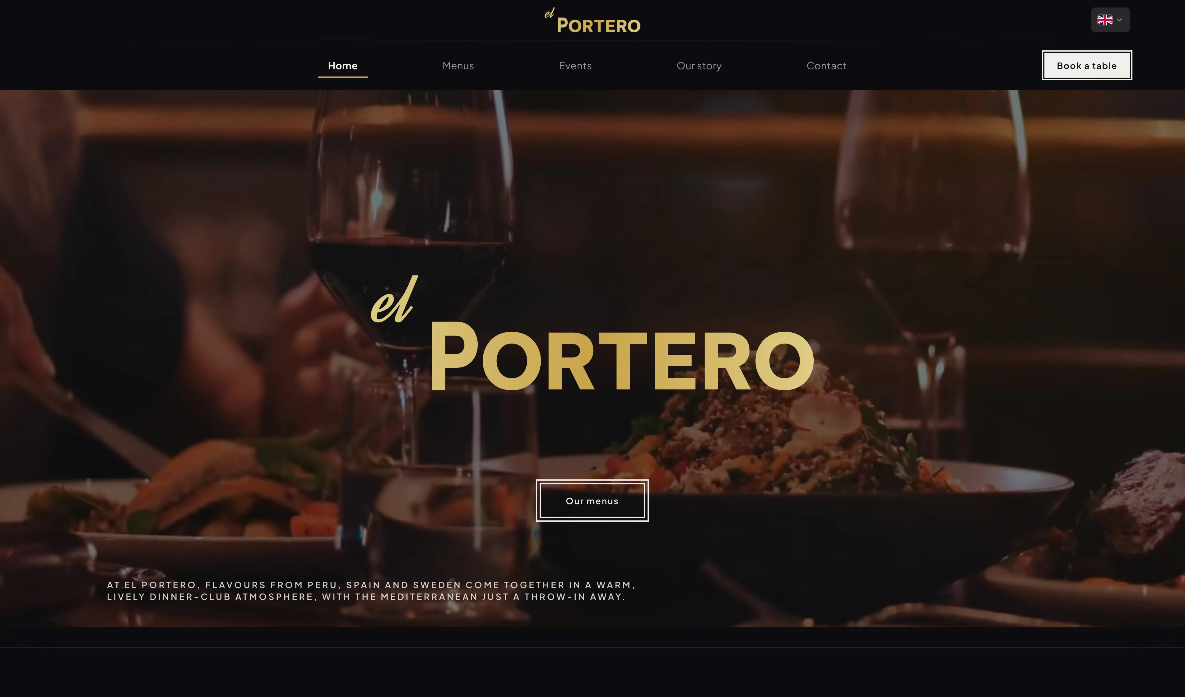
A warm, premium site where browsing menus and booking a table feel effortless.
Background
El Portero is a restaurant in Spain. They wanted a site that felt as warm and polished as dining in the room, not cold or over-designed, and made it easy to browse menus and book a table.
The brief came with a tight deadline and almost nothing to start from: no website, no brand kit, and an owner and manager who knew hospitality, not tech. We skipped a site builder and built a custom guest site and admin portal instead, shaped in ongoing dialogue so it could grow with new features and, eventually, more locations.
Two surfaces, one system: a public website for atmosphere, menus, and BokaBord booking, and a staff admin portal for events, menus, and hours, published when the team is ready.
How might we give guests that same warm, premium feeling online, and make booking feel effortless?
My role
Sole designer and developer from concept to launch: brand (logo and menus), guest website, and staff admin portal, plus BokaBord integration, performance tuning, and hands-on training so the team could publish updates on their own.
18 000 +
Monthly pageviews (sustained traffic)
12 000 +
Monthly unique visitors
Seamless booking
Booking connected via leading platform BokaBord
2
Connected surfaces: guest site & admin portal
Role
Tools
Timeline
Context
Collaboration
Research
Discovery before design
Stakeholder conversations
Early and ongoing conversations with the owner and manager: how the brand should feel online, what guests ask before booking, and what staff update most: events, menus, and hours.
The tension was familiar: modern and premium, but never cold. It had to feel as welcoming as walking through the door.
Direction before screens
Sat down with the owner and manager to walk through early ideas: mood, layout approaches, and how the site could feel premium without going cold. We discussed options and agreed on a general direction before any deep screen work.
The point was to avoid pouring hours into explorations that would miss the mark. Locking in the feel upfront made the detailed design phase faster and more confident.
Guest journey mapping
Mapped how people find the restaurant (search, social, word of mouth) and what they need before booking: the vibe, readable menus, practical details, and booking that works on a phone.
Browsing and booking are one flow. Friction in the middle costs trust before anyone reaches BokaBord.
Landscape & benchmark review
Looked at peer restaurant sites to see what felt premium, what looked like a template, and where booking got buried.
The same patterns kept showing up: beautiful photos, messy menus, hidden booking buttons, and admin tools that break when the restaurant outgrows them.
Process
UX approach
Discovery & direction
Mapped what guests need before they trust enough to book: clear menus, atmosphere, location, and a straight path to reserve, on mobile or desktop.
That guest lens, together with the direction agreed with the owner and manager, shaped restrained type, generous space, and photography-led layouts.
Flows & structure
Built clear paths for menus, practical info, and BokaBord booking, short and easy to follow.
For staff: workflows for events, menus, and hours that publish to the public site only when they're ready.
Build & integration
Built the guest site and admin portal in code, wired booking to BokaBord, and kept staff updates in sync across both. GitHub for version control; Cursor for day-to-day design and development.
Tuned how content, images, and video are stored and served so the site stays fast under real traffic, not just on launch day.
Challenges
What made this hard
Custom scope on a real deadline
A guest site plus a custom admin portal on a short deadline: no site builder, no big team. Brand, menus, and visual direction all had to be created in the same push, with no existing assets to lean on.
Every choice had to work for day one while leaving room to add features and scale beyond one location, without building tools staff would never use.
A shareholder with limited time
The main shareholder had very little time to spare and was often hard to reach. Quick check-ins were the exception, not the rhythm of the project.
To keep momentum on a tight deadline, many decisions had to be made from research, peer benchmarks, and design instinct, then brought back for validation when we did connect.
Two audiences, one product
Guests want atmosphere, clear menus, and a fast path to book. Staff want simple tools to update events, menus, and hours, and control over when changes go live.
The hard part was serving both without admin complexity leaking into the public site, or brand polish getting in the way of back-office tasks.
Performance under sustained load
With thousands of monthly visitors, the site had to stay fast after launch, not just look good on day one, while serving menus, images, and video under real load.
Performance became a design constraint: rich media without punishing load times on mobile.
Booking without owning the flow
BokaBord handles reservations well, but the handoff from the restaurant's site often feels bolted on: wrong visuals, unclear next step, CTAs that break the brand moment.
The job was making BokaBord feel native to El Portero while accepting that the booking flow itself lived outside my scope.
Process
What I did
01
Premium without friction
Brand & guest experience
A public site that reads premium through layout and pacing, not decoration: browsing feels considered, booking feels obvious. I also designed the logotype and print menus so the brand carries from screen to street.
Key decision
Led with video and photography, restrained type, and calm navigation. Booking via BokaBord always one clear step away.
Why: Guests should feel the restaurant's warmth right away. Burying reservations behind brand theatre would hurt conversion.
02
Booking without reinventing the wheel
BokaBord integration
I didn't design the booking flow itself. CTAs across the site link to BokaBord where guests expect them, styled to fit the restaurant's look and feel.
Key decision
Linked booking on the guest site to BokaBord instead of building a reservation flow from scratch.
Why: BokaBord already works. My job was making it easy to reach from the restaurant's own site.
03
Tools the team actually needs
Admin portal
Admin views for what staff do every day: events, food and drink menus, opening hours, published to the guest site when they choose.
The owner, manager, and floor team aren't technical, so delivery included walking them through the portal: what each screen does, how drafts work, and how changes show up publicly.
Key decision
Built a staff portal around events, menus, and hours, not a generic CMS, with room to add features and scale beyond one location.
Why: The client needed something they could grow into. Off-the-shelf builders tend to hit walls when operations change or new locations come online.
04
One system, two audiences
Integrations & delivery
Wired BokaBord on the guest side to staff publishing on the back office, then shipped both so the restaurant could run the full loop from day one: discover, book, and keep menus, events, and hours current.
Key decision
One product, shared data: guest site and admin portal built together, not as separate projects that drift apart.
Why: When booking and admin updates live in the same system, staff and guests always see the same information.
05
Built for sustained traffic
Performance optimization
Tuned storage, images, and page loading so the experience stays fast when traffic is high, not only on launch day.
Key decision
Treated performance as a design requirement from the start, not a polish pass at the end.
Why: Guests browse menus and book in steady numbers. A site that stutters under load undermines the brand as fast as a weak layout.
“The site had to feel like the restaurant, not a template with a logo dropped in. That shaped every layout and every booking decision.”
Insights
What the research revealed
- 01
Guests decide on trust long before they book. Atmosphere, readable menus, and practical details matter more than decorative flourishes.
- 02
Staff didn't want a CMS that publishes instantly by default. They needed to know edits go live only when they choose.
- 03
A site builder might have worked for launch, but would have fought the restaurant later, especially as operations grew and more locations became part of the plan.
- 04
Booking conversion is about placement and clarity, not reinventing the reservation flow. Clear CTAs to BokaBord beat clever navigation.
- 05
On a busy hospitality site, a slow load feels unprofessional faster than a weak photo. Performance is part of the brand promise.
Takeaways
What I learned
- 01
Premium hospitality UI is often about restraint: fewer elements, clearer hierarchy, and confidence in whitespace.
- 02
Design for staff as much as guests. A beautiful public site fails if the team can't run it, and training non-technical staff was as important as the UI.
- 03
Performance deserves the same care as the hero section. A premium site that loads slowly, or chokes under traffic, breaks the promise immediately.
- 04
End-to-end ownership helped: decisions in Figma survived in code because the same person carried them through build, integrations, and optimization.