Project Overview
8 min read
Design System
UX Research
UI Design
Prototype
Wireframing
Market Research
Live Site
Emplojd is a web application designed and developed for the Chas Challenge during my studies at Chas Academy.
Emplojd is the result of an 8-week intensive project which I worked on outside my curricular studies. It was aimed at simplifying the job application process. The platform allows users to create an account, log in, search for jobs through an API, generate personalized cover letters based on personal information and the intended job, all through AI. Once logged in the user can also save both job ads and cover letters for future reference.
My role focused extensively on leading and managing the UX/UI design, ensuring the platform is not only functional but also provides an intuitive and enjoyable user experience.
🔬 Stage 1 : Research & Planning
Collaborative Framework
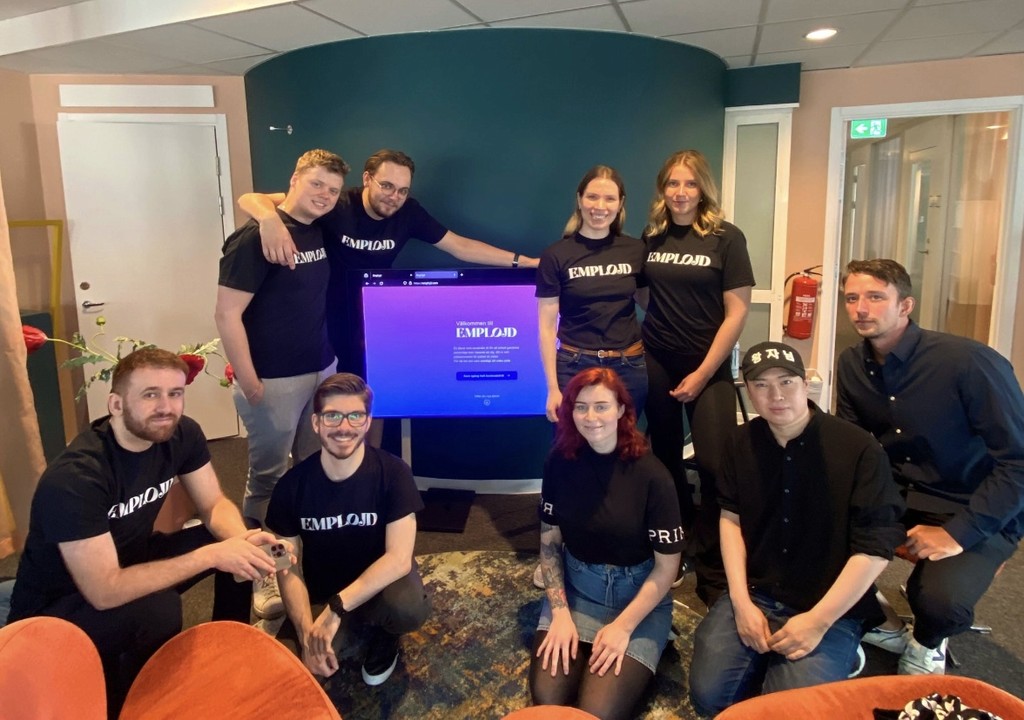
To ensure effective collaboration, we quickly established clear roles based on team members' strengths and organized a schedule that kept everyone on track. This structure helped maintain smooth progress throughout the project.
Sprint Planning
With an 8-week timeline, setting clear goals was crucial. We employed structured sprint planning, breaking tasks down by team (UX, Frontend, Backend, DevOps) and regularly tracking progress through meetings and to-do boards. This approach kept our cross-team objectives aligned and ensured we met our deadlines.
Competitor Analysis & Initial Research
We started with quick research into competitors like LinkedIn, Arbetsförmedlingen, and Indeed. By analyzing their features and color schemes, we identified key elements to incorporate into our project. To stand out, we chose a unique gradient color scheme, setting our brand apart from others in the market.
🏗️ Stage 2 : Wireframes
Initial Concepts
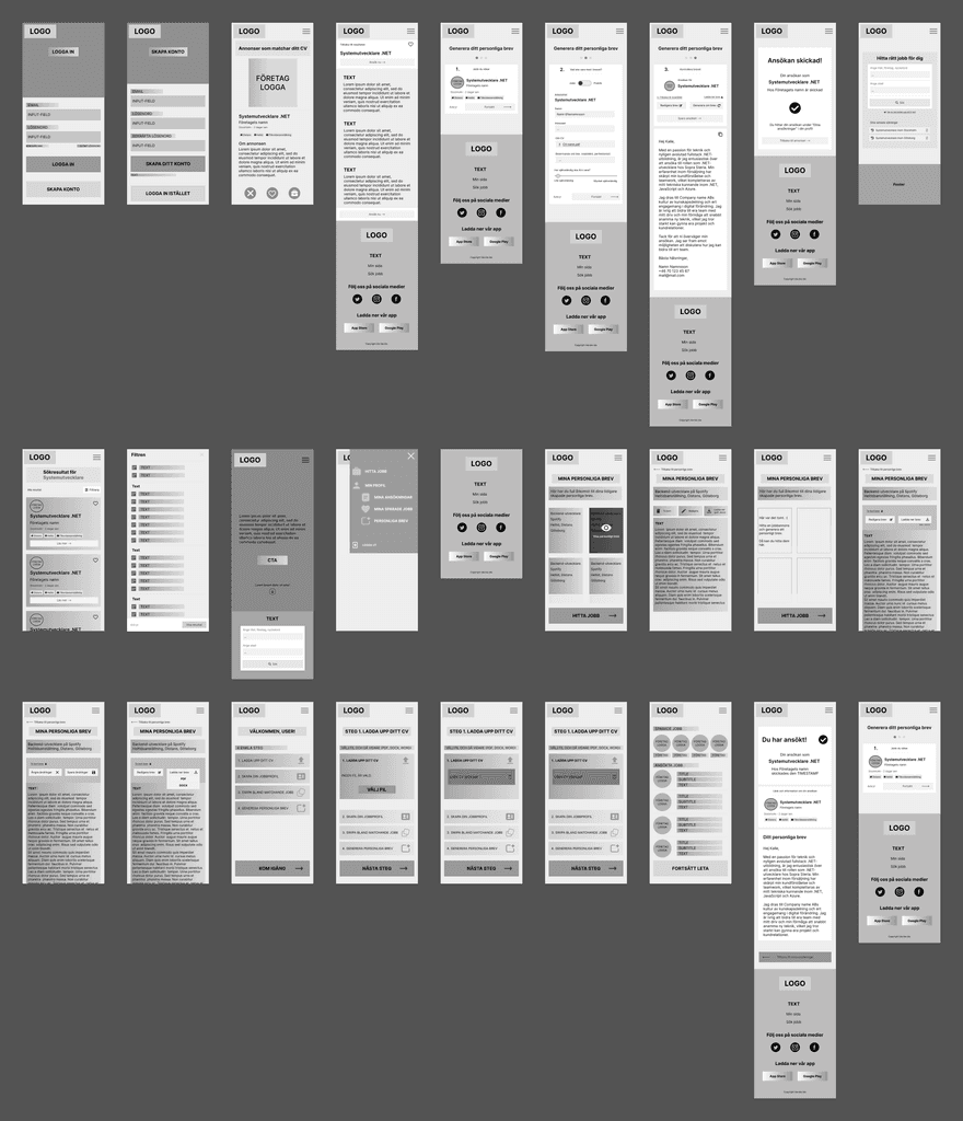
After completing our research, we transitioned to creating wireframes to bring our ideas to life. We started by brainstorming and sketching initial concepts, ensuring they aligned with our project's goals and addressed user needs.
Low-Fidelity Wireframes
We began with low-fidelity wireframes, focusing on the layout and user flow without getting bogged down by design details. This stage helped us map out the structure and functionality of the site, emphasizing intuitive navigation and easy access to key features.
Feedback & Iteration
With the low-fidelity wireframes in hand, we sought feedback from the team and made iterative improvements. We prioritized usability, refined key features, and ensured a logical, seamless flow between sections, continually enhancing the user experience.
🎨 Stage 3 : Design System
Establishing a Foundation
After finalizing the wireframes, I developed a comprehensive design system to ensure consistency throughout the project. This foundation included essential design principles and guidelines.
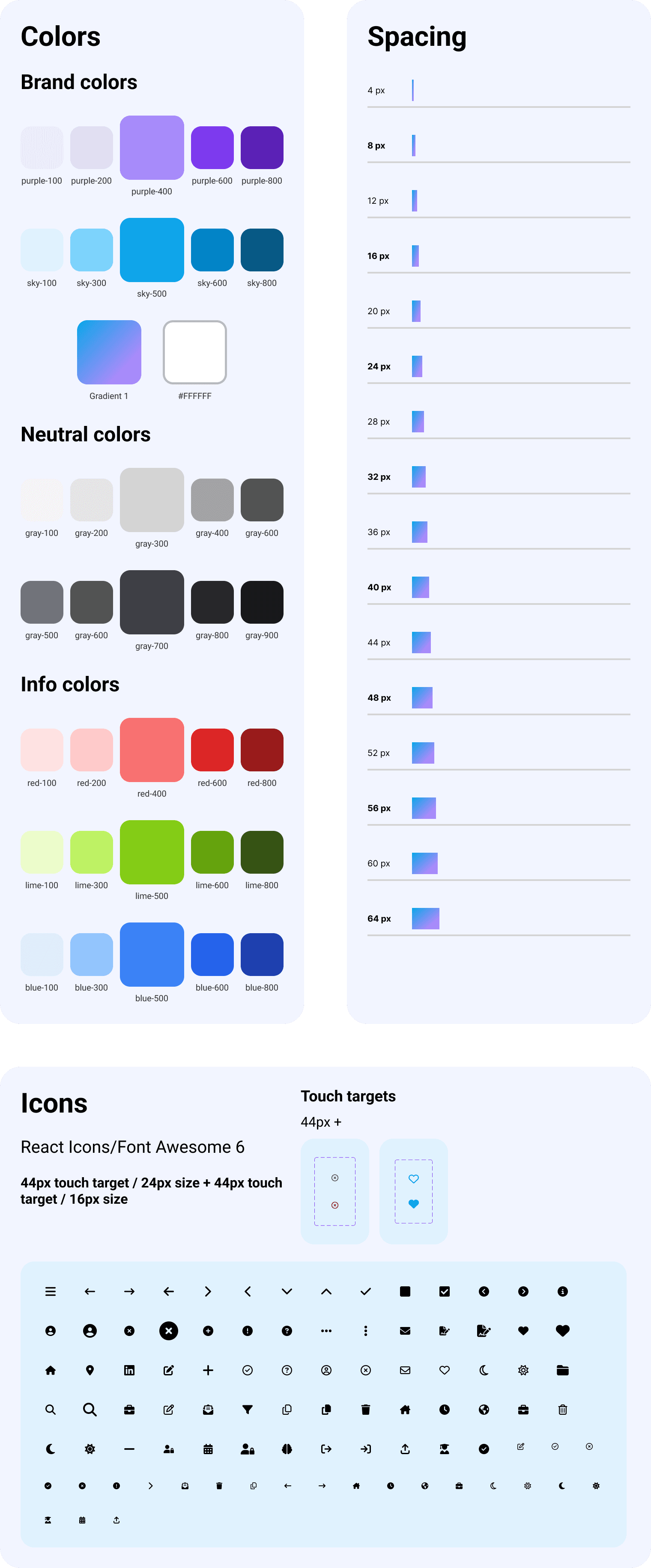
Spacing and Color Palette
We established a consistent spacing system and defined a unique color palette to create a cohesive visual identity. The spacing system maintained visual harmony, while the color palette, including primary, secondary, and accent colors, set our brand apart.
Icons
To enhance usability, I integrated a set of icons from React Icons and Font Awesome 6, ensuring clarity and accessibility. We established usage guidelines for icon sizes, ensuring consistency across devices and improving the overall user experience.
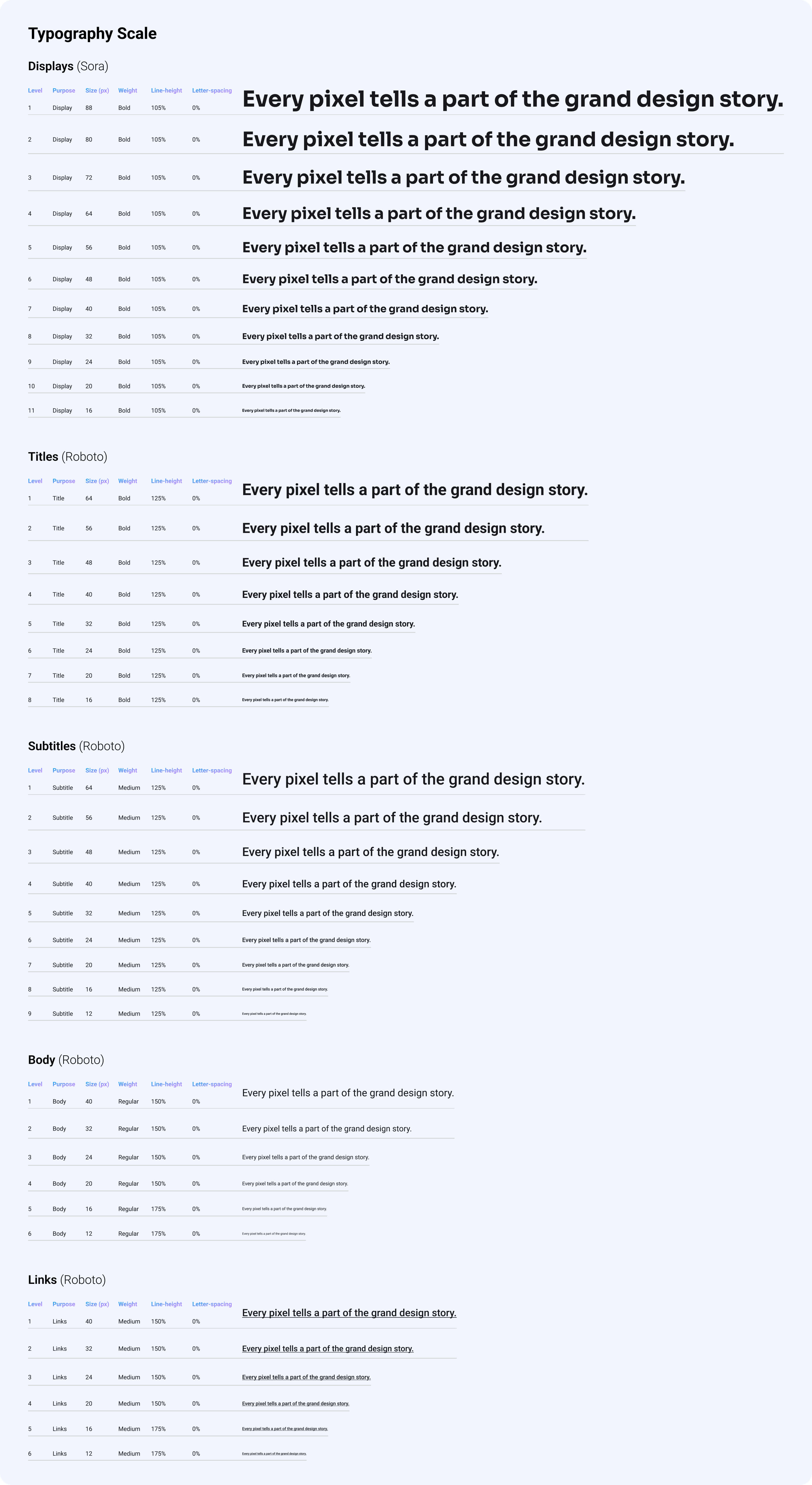
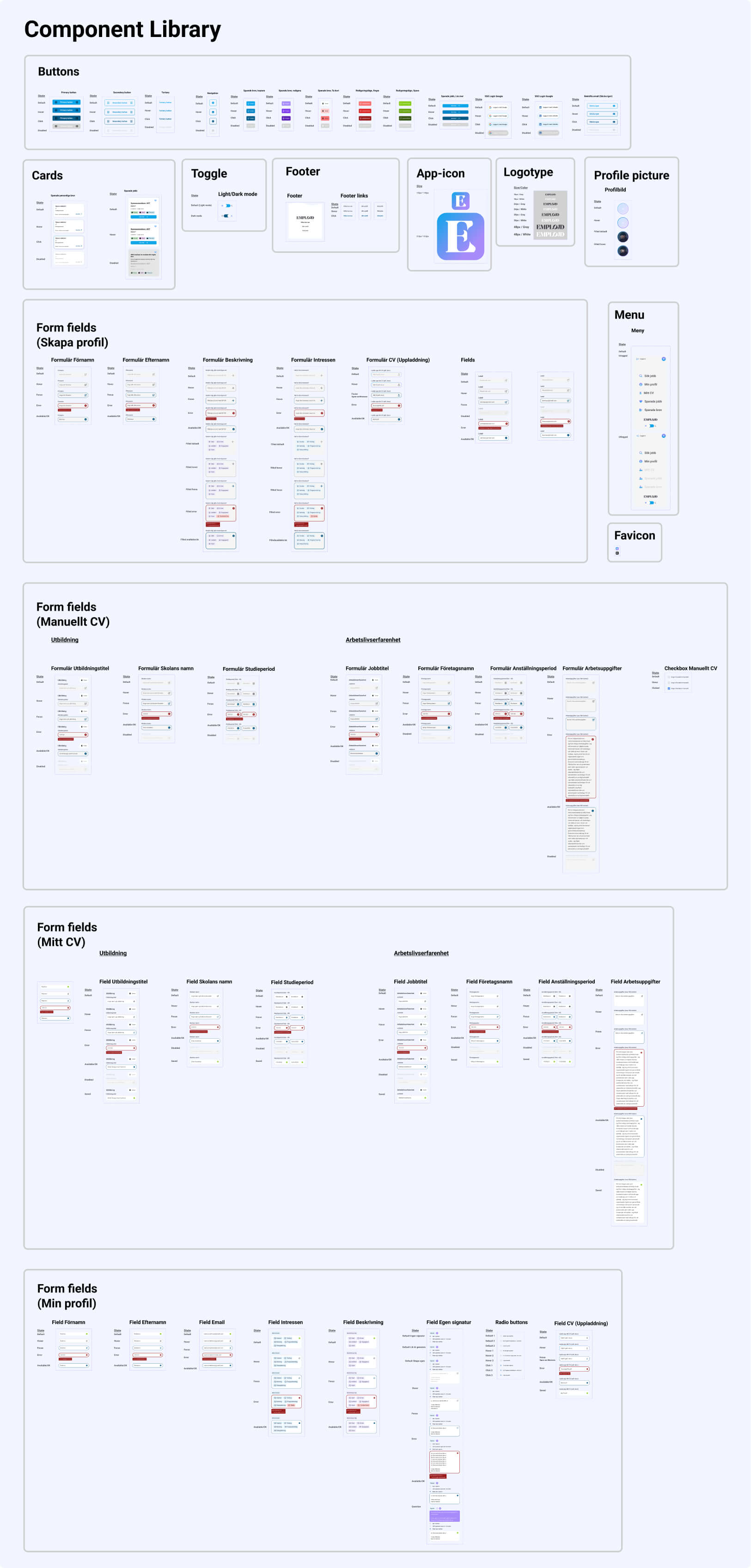
Typography Scale & Component Library
The typography scale and component library were key to maintaining a consistent visual language. We carefully selected fonts and defined guidelines for text elements, ensuring readability and a clear visual hierarchy. The component library, featuring reusable elements like buttons and forms, streamlined the design process and ensured uniformity across all UI elements, reinforcing our brand identity.
🖼️ Stage 4 : Mockups
Transforming Concepts into Reality
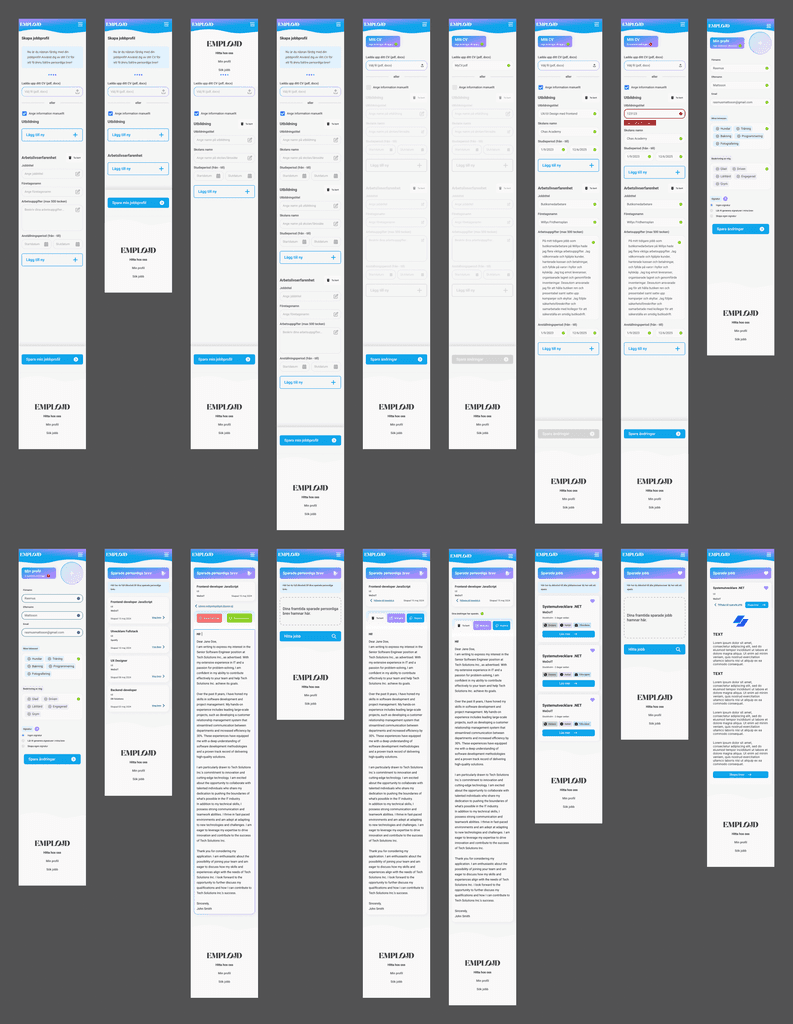
Transitioning from wireframes to high-fidelity mockups was a key milestone where our design concepts began to take tangible form. This stage brought together the elements defined in our design system—typography, color schemes, and components—into fully realized user interfaces that aligned with our brand identity and user expectations.
Crafting High-Fidelity Designs
Our approach was iterative, allowing us to refine both visual and functional aspects of the mockups. We focused on creating an intuitive and engaging user experience by integrating consistent visual elements, ensuring that typography and color palettes worked together to establish a clear visual hierarchy.
Designing Interactive Elements
Mockups also allowed us to explore and refine interactive components like buttons, toggles, and navigation elements. We tested various layouts to achieve a balance between aesthetics and functionality, ensuring a cohesive interface that intuitively guided users through their journey.
Simulating User Journeys
We used the mockups to simulate user interactions, analyzing how users would navigate across different screens. This dynamic representation helped us identify and address any potential friction points or inconsistencies, ensuring smooth transitions and an optimal user experience.
Mockups played a crucial role in aligning the team's vision. They offered a realistic preview of the final product, facilitating feedback and discussions among the team. This collaboration allowed us to address any concerns early, streamlining the transition to development.
Visual Refinement
Beyond functionality, we focused on visual refinement, fine-tuning details like shadows, gradients, and spacing. This attention to aesthetics ensured that the final design was modern, clean, and resonated with the target audience.
Preparing for Development
By the end of this stage, we had a comprehensive set of screens that served as a detailed blueprint for the development team. This preparation ensured a smooth handoff, with minimal discrepancies between design and the final product.
💻 Stage 5 : Interactive Prototype
Bringing the Design to Life
As our design and development efforts progressed, the project naturally evolved into an interactive prototype. With the website being coded alongside the design process, users could engage with the live site early on, experiencing the intended functionality and design firsthand.
Figma Prototype for Rapid Testing
In addition to the live website, I developed an interactive prototype in Figma. This served as a valuable tool for rapid testing and iteration, allowing us to quickly gather feedback and make necessary refinements. The Figma prototype facilitated swift adjustments, ensuring that design decisions could be evaluated before they were fully implemented in code.
The Live Site as the True Prototype
However, the real essence of our prototype was the live site itself. By seeing the design and code come together in real-time, we were able to provide a true representation of the final product. This approach allowed us to test the user experience in a realistic environment, ensuring that the final result was both functional and visually cohesive.
🧪 Stage 6 : User Testing
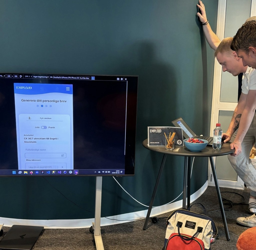
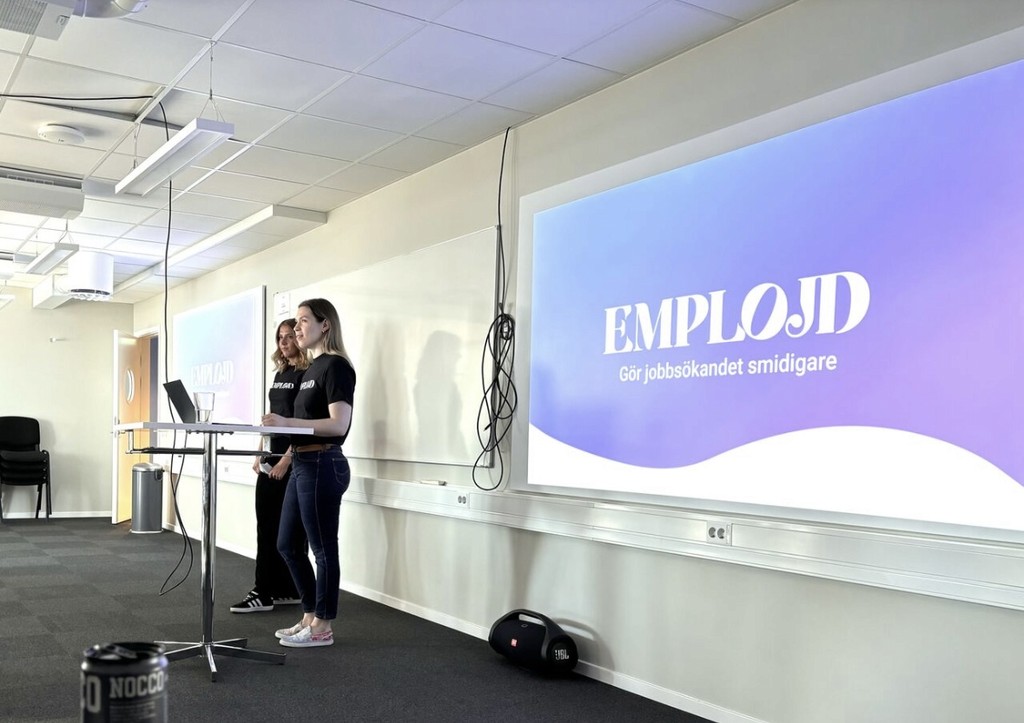
User testing was an integral part of our project, conducted during a live-demo session on the day we presented our product. We invited teachers, students, and professionals from various tech companies to interact with our website, giving us valuable insights into how our design and functionality performed in real-world scenarios.
This live user testing allowed us to observe firsthand how different user groups engaged with our site, highlighting areas of success as well as aspects that needed improvement.
Although the Chas Challenge concluded with this demo, the feedback we gathered would serve as a crucial starting point if we were to continue developing the product. The insights from our users would guide future iterations, ensuring that our website would meet the needs and expectations of its intended audience.
🔍 Stage 7 : Results & Reflections
Our project aimed to create a user-centric, functional website with standout design and usability, a goal we successfully achieved. Positive feedback highlighted the intuitive navigation, clean design, and accessibility, showing that users quickly adapted with minimal guidance.
Key takeaways include the value of iterative design and the importance of user testing. Real-time collaboration with the development team was crucial in refining the product. However, more extensive user testing earlier on would have provided even deeper insights.
Looking forward, future work would focus on further refining the design based on user feedback, ensuring continued improvement in the user experience. This project has reinforced the importance of a user-centered approach in digital product development.

