Teknikguiden
E-Commerce platform simplifying PC-building for beginners & professionals
Project Overview
8 min read
UX Research
Market Research
Feedback
Leadership
Design System
UI Design
Prototyping
Wireframing
Mockups
Accessibility
Teknikguiden is a comprehensive online store interface designed over a 10-week period as part of a course at Chas Academy. The project, driven by a team of five dedicated UX/UI design students, aimed to create a beginner-friendly platform that simplifies the process of browsing, selecting, and purchasing PC components and pre-built systems.
Our primary focus was on refining the design and research processes, with an emphasis on user feedback to ensure an intuitive shopping experience. While the main design efforts were directed towards the desktop interface, we also developed some screens, mockups, and wireframes for mobile devices.
In the absence of a designated leader, I stepped up to take the overall responsiblity to ensure we stayed on track and maintained the highest standards throughout the project. This role involved overseeing our progress and making sure no corners were cut in our design process.
Key features of Teknikguiden include categorized browsing of pre-built PCs and components, detailed guides on PC assembly, a smart PC builder tool with customizable parts, and a streamlined checkout process. The platform was designed to empower users, from novices to tech enthusiasts, by providing them with the tools and information they need to make informed decisions.


🔬 Stage 1 : Research
Mapping the User Journey: Crafting the Experience Roadmap
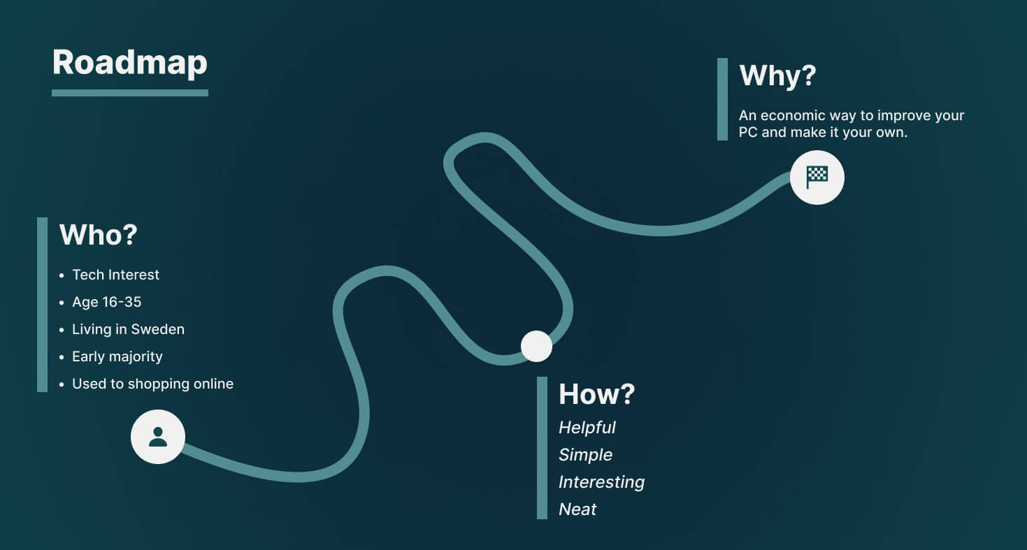
The foundation of our project began with creating a comprehensive experience roadmap, designed to visualize the user’s journey from the moment they enter Teknikguiden to the completion of their purchase. We analyzed each interaction point, considering how users would navigate the site, the emotions they might experience at various stages, and potential pain points. This roadmap served as our guiding blueprint, ensuring that every design decision aligned with enhancing the overall user experience.

Analyzing Industry Trends: Insights from Market Research
To ground our design decisions in real-world data, we conducted in-depth market research focusing on existing e-commerce platforms for PC components and pre-built systems. We studied leading competitors, identified gaps in their offerings, and analyzed user reviews to understand common frustrations and desires. This research informed our strategy, allowing us to position Teknikguiden uniquely in the market by addressing unmet needs and delivering a superior shopping experience.
Understanding the Target Audience Through Qualitative User Research
Recognizing the importance of user-centered design, we engaged in qualitative user research to understand our target audience's needs, preferences, and pain points. Through a series of interviews, surveys, and usability tests with both novices and experienced tech enthusiasts, we gathered valuable insights into their expectations and challenges when shopping for PC components. This research was instrumental in shaping the user interface and experience, ensuring that Teknikguiden was not just another online store but a user-friendly platform tailored to its audience's specific needs.
🏗️ Stage 2 : MVP & Wireframes
Defining the MVP by Establishing Core Functionality
With a clear understanding of our users and market, the next step was to define the Minimum Viable Product (MVP) for Teknikguiden. Our goal was to identify the essential features that would deliver the most value to users while allowing us to launch quickly and iterate based on real-world feedback. We prioritized features like the categorized browsing, smart PC builder tool, and streamlined checkout process, ensuring that these core functionalities were robust and user-friendly from the outset.
Moving from Low to High Fidelity Wireframes
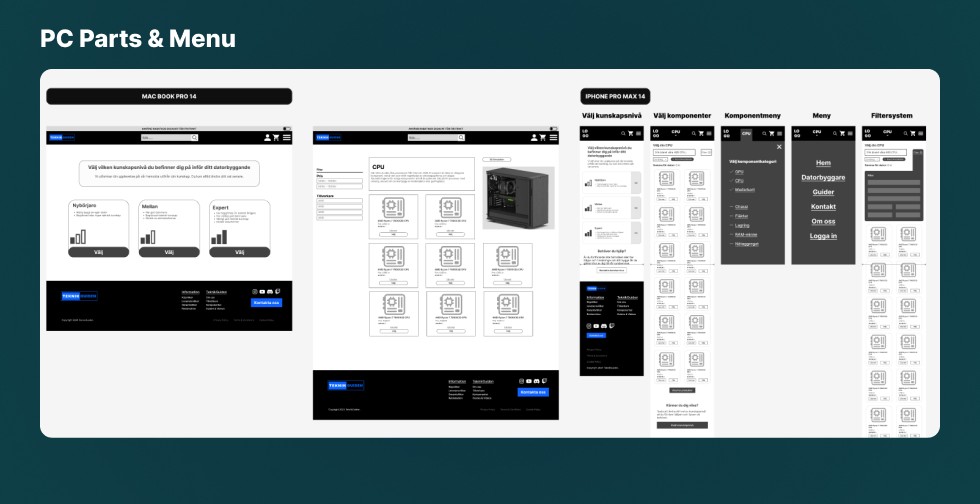
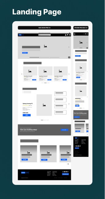
Once the MVP was defined, we began translating our ideas into visual form through wireframes. Starting with low-fidelity sketches, we focused on layout and flow, iterating rapidly to explore different design possibilities. As our concepts solidified, we developed high-fidelity wireframes that captured the look and feel of the final product. These detailed designs served as the blueprint for our development phase, ensuring a consistent and cohesive user interface across all screens.
Improving Through Feedback and Iteration
Understanding that design is an iterative process, we sought continuous feedback from peers, instructors, and potential users. Each round of feedback was invaluable, highlighting areas for improvement and sparking new ideas. We embraced this iterative cycle, refining our wireframes based on the insights we gathered, which allowed us to enhance the usability and aesthetic appeal of Teknikguiden before moving on to the development stage.



🎨 Stage 3 : Design System
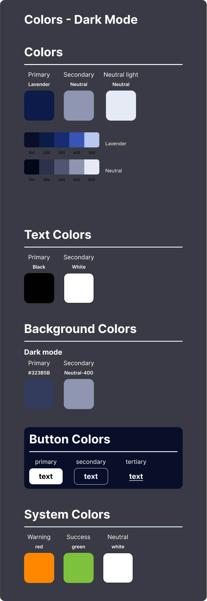
Setting the Foundation with Spacing and Colors
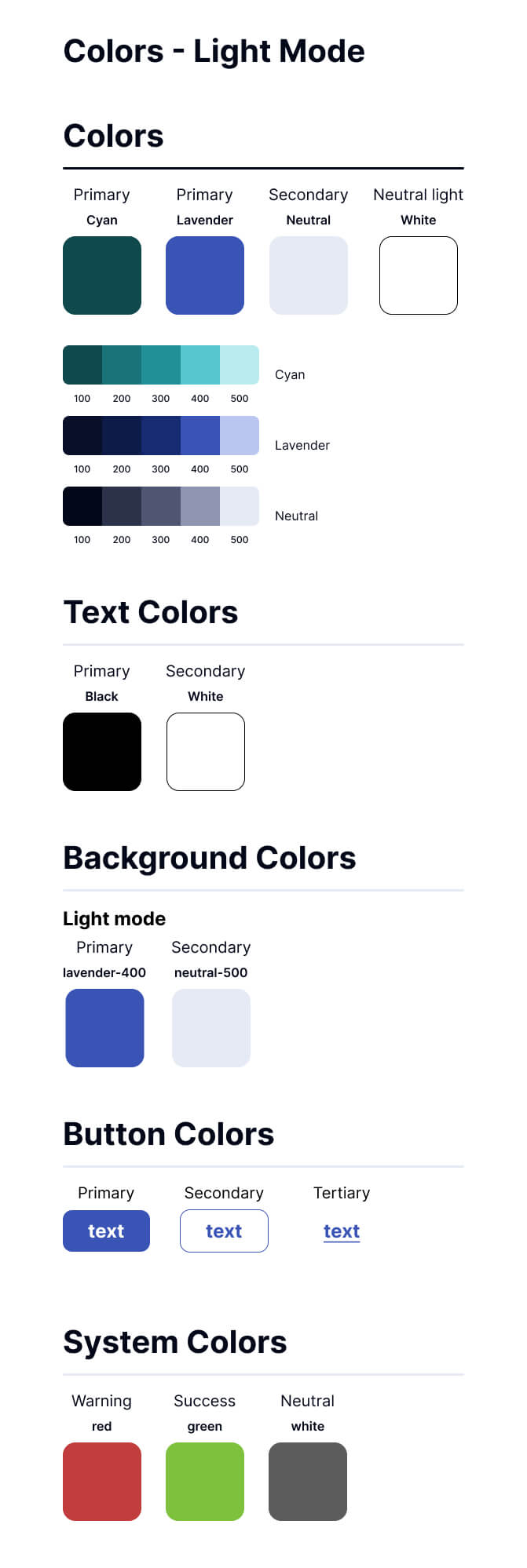
In this stage, we established the design system that would ensure consistency across all elements of Teknikguiden. We began by defining a cohesive color palette and spacing guidelines that aligned with our brand identity and user needs. The goal was to create a visually appealing and user-friendly interface, with sufficient contrast and spacing to enhance readability and navigation throughout the platform.
Developing a Cohesive Visual Language and Icons
Next, we crafted a unified visual language that included custom icons and visual elements designed to guide users intuitively through the site. The icons were designed to be simple yet informative, ensuring clarity in communication without overwhelming the user. This visual language became a crucial aspect of our design system, reinforcing brand recognition and contributing to a seamless user experience.
Building the Typography Scale and Component Library
To maintain consistency in text hierarchy and readability, we developed a typography scale that defined font sizes, weights, and styles for various content types. Additionally, we created a component library that included buttons, forms, cards, and other UI elements. This library served as a reference for the entire team, ensuring that all components adhered to our design principles and contributed to a cohesive and polished final product.




🖼️ Stage 4 : Mockups
Realizing the Wireframes
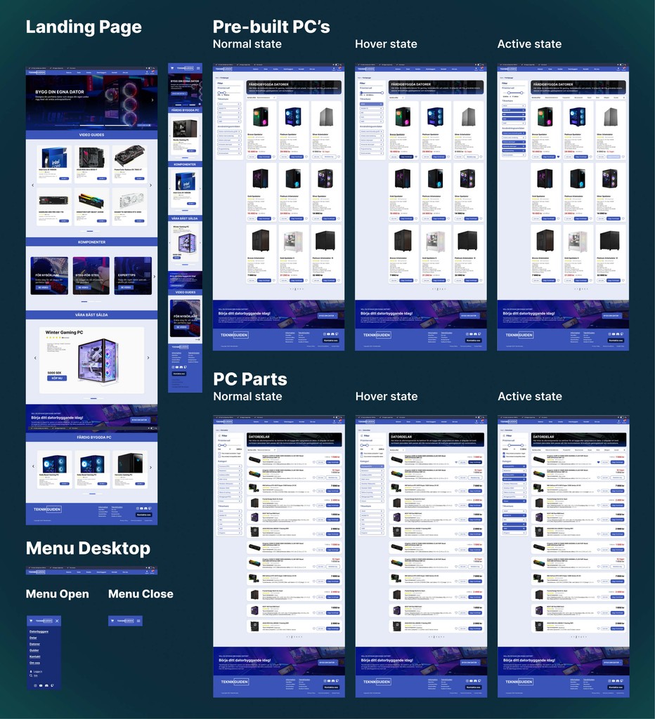
With our design system in place, we moved on to developing high-fidelity mockups that brought our wireframes to life. These mockups closely resembled the final product, incorporating all visual elements, colors, and typography. The goal was to create a realistic representation of the user interface, enabling users to visualize how Teknikguiden would look and feel in its completed form.
Preparing the Mockups for Prototyping
Once the high-fidelity mockups were finalized, we began preparing them for the prototyping phase. This involved organizing the mockups into a cohesive flow that mimicked real user interactions, allowing us to test the overall user experience in a simulated environment. This step was crucial for identifying any potential usability issues before moving on to more detailed testing.
Incorporating Feedback and Making Alterations
As with earlier stages, feedback was integral to refining our mockups. We conducted several review sessions with peers and instructors, gathering insights that led to minor adjustments in design and functionality. These alterations ensured that our mockups not only met the project requirements but also exceeded user expectations, setting the stage for a successful prototype.

💻 Stage 5 : Interactive Prototype
Transforming Designs into an Interactive Experience
In this stage, we took our high-fidelity mockups and transformed them into an interactive prototype using Figma. The goal was to simulate real user interactions, allowing us to test the flow and functionality of Teknikguiden in a dynamic environment. This interactive prototype was crucial for identifying any issues that weren’t apparent in static designs, ensuring a seamless user experience.
Preparing for Usability Testing
As the prototype reached completion, we prepared it for the next stage—usability testing. We ensured that the prototype was detailed and polished, ready to be tested by real users in the following stage. This preparation was crucial for gathering meaningful insights and feedback, which would guide the final refinements
🧪 Stage 6 : Usability Testing
Designing the Usability Test to Validate Our Assumptions
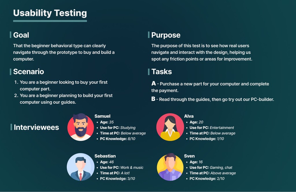
For the usability testing phase, we crafted a series of scenarios that reflected real-world tasks our target users would encounter when using Teknikguiden. The primary goal was to observe how beginner users navigated the platform, with specific focus on purchasing a computer part and using the PC builder tool. We selected a diverse group of participants to cover a range of experiences and familiarity with PCs, ensuring that our findings would be relevant across different user profiles.
Conducting the Tests: Observing Real User Interactions
The usability tests were conducted with four participants, each representing a different user archetype in terms of age, PC knowledge, and usage habits. During the sessions, we observed how users interacted with the prototype, paying close attention to any confusion, hesitation, or errors. This allowed us to identify specific friction points and areas where the user experience could be improved.
Key Findings and Insights from the Usability Testing
The usability tests provided several valuable insights:
Navigation Challenges: Some participants, particularly those with lower PC knowledge, struggled with navigating the PC builder tool. This highlighted the need for clearer labels and perhaps a more guided onboarding process.
Checkout Process: The checkout process was generally smooth, but a few users were unsure about the steps required to finalize their purchase. Streamlining this process and providing clearer prompts could enhance the user experience.
Engagement with Guides: The guides were well-received, particularly by users who were new to PC building. However, some participants suggested adding more visual aids or short videos to make the content easier to digest.
Defining Future Improvements Based on Test Results
Although the project concluded with usability testing, the findings have laid out a clear roadmap for potential future enhancements:
Enhancing Navigation: The first step would be to reorganize the structure for the PC builder tool to make it more intuitive, particularly for beginners. Adding tooltips or a guided tour feature could help users better understand how to navigate the platform.
Streamlining the Checkout Process: Improving the checkout flow by adding more intuitive prompts and clearer instructions would be a priority. This would ensure that users, especially those less familiar with online shopping, can complete their purchases with confidence.
Enhancing the Guides: Adding more visual content, such as infographics or short explainer videos, to the guides would make them even more accessible. This could be particularly beneficial for users who prefer visual learning over reading text-heavy content.


🔍 Stage 7 : Results
Defining Future Improvements Based on Test Results
Although the project concluded with usability testing, the findings have laid out a clear roadmap for what out potential future enhancements would be:
Enhancing Navigation: The first step would be to reorganize the structure for the PC builder tool to make it more intuitive, particularly for beginners. Adding tooltips or a guided tour feature could help users better understand how to navigate the platform.
Streamlining the Checkout Process: Improving the checkout flow by adding more intuitive prompts and clearer instructions would be a priority. This would ensure that users, especially those less familiar with online shopping, can complete their purchases with confidence.
Enhancing the Guides: Adding more visual content, such as infographics or short explainer videos, to the guides would make them even more accessible. This could be particularly beneficial for users who prefer visual learning over reading text-heavy content.
<— BACK TO TOP
Thank you for visiting my portfolio. I look forward to sharing my design journey with you. If you'd like to know more or talk design, don't hesitate to reach out.
Let's get to know each other.

🔬 Stage 1 : Research
Mapping the User Journey: Crafting the Experience Roadmap
The foundation of our project began with creating a comprehensive experience roadmap, designed to visualize the user’s journey from the moment they enter Teknikguiden to the completion of their purchase. We analyzed each interaction point, considering how users would navigate the site, the emotions they might experience at various stages, and potential pain points. This roadmap served as our guiding blueprint, ensuring that every design decision aligned with enhancing the overall user experience.

Analyzing Industry Trends: Insights from Market Research
To ground our design decisions in real-world data, we conducted in-depth market research focusing on existing e-commerce platforms for PC components and pre-built systems. We studied leading competitors, identified gaps in their offerings, and analyzed user reviews to understand common frustrations and desires. This research informed our strategy, allowing us to position Teknikguiden uniquely in the market by addressing unmet needs and delivering a superior shopping experience.
Understanding the Target Audience Through Qualitative User Research
Recognizing the importance of user-centered design, we engaged in qualitative user research to understand our target audience's needs, preferences, and pain points. Through a series of interviews, surveys, and usability tests with both novices and experienced tech enthusiasts, we gathered valuable insights into their expectations and challenges when shopping for PC components. This research was instrumental in shaping the user interface and experience, ensuring that Teknikguiden was not just another online store but a user-friendly platform tailored to its audience's specific needs.
🏗️ Stage 2 : MVP & Wireframes
Defining the MVP by Establishing Core Functionality
With a clear understanding of our users and market, the next step was to define the Minimum Viable Product (MVP) for Teknikguiden. Our goal was to identify the essential features that would deliver the most value to users while allowing us to launch quickly and iterate based on real-world feedback. We prioritized features like the categorized browsing, smart PC builder tool, and streamlined checkout process, ensuring that these core functionalities were robust and user-friendly from the outset.
Moving from Low to High Fidelity Wireframes
Once the MVP was defined, we began translating our ideas into visual form through wireframes. Starting with low-fidelity sketches, we focused on layout and flow, iterating rapidly to explore different design possibilities. As our concepts solidified, we developed high-fidelity wireframes that captured the look and feel of the final product. These detailed designs served as the blueprint for our development phase, ensuring a consistent and cohesive user interface across all screens.
Improving Through Feedback and Iteration
Understanding that design is an iterative process, we sought continuous feedback from peers, instructors, and potential users. Each round of feedback was invaluable, highlighting areas for improvement and sparking new ideas. We embraced this iterative cycle, refining our wireframes based on the insights we gathered, which allowed us to enhance the usability and aesthetic appeal of Teknikguiden before moving on to the development stage.


🎨 Stage 3 : Design System
Setting the Foundation with Spacing and Colors
In this stage, we established the design system that would ensure consistency across all elements of Teknikguiden. We began by defining a cohesive color palette and spacing guidelines that aligned with our brand identity and user needs. The goal was to create a visually appealing and user-friendly interface, with sufficient contrast and spacing to enhance readability and navigation throughout the platform.
Developing a Cohesive Visual Language and Icons
Next, we crafted a unified visual language that included custom icons and visual elements designed to guide users intuitively through the site. The icons were designed to be simple yet informative, ensuring clarity in communication without overwhelming the user. This visual language became a crucial aspect of our design system, reinforcing brand recognition and contributing to a seamless user experience.
Building the Typography Scale and Component Library
To maintain consistency in text hierarchy and readability, we developed a typography scale that defined font sizes, weights, and styles for various content types. Additionally, we created a component library that included buttons, forms, cards, and other UI elements. This library served as a reference for the entire team, ensuring that all components adhered to our design principles and contributed to a cohesive and polished final product.


🖼️ Stage 4 : Mockups
Realizing the Wireframes
With our design system in place, we moved on to developing high-fidelity mockups that brought our wireframes to life. These mockups closely resembled the final product, incorporating all visual elements, colors, and typography. The goal was to create a realistic representation of the user interface, enabling users to visualize how Teknikguiden would look and feel in its completed form.
Preparing the Mockups for Prototyping
Once the high-fidelity mockups were finalized, we began preparing them for the prototyping phase. This involved organizing the mockups into a cohesive flow that mimicked real user interactions, allowing us to test the overall user experience in a simulated environment. This step was crucial for identifying any potential usability issues before moving on to more detailed testing.
Incorporating Feedback and Making Alterations
As with earlier stages, feedback was integral to refining our mockups. We conducted several review sessions with peers and instructors, gathering insights that led to minor adjustments in design and functionality. These alterations ensured that our mockups not only met the project requirements but also exceeded user expectations, setting the stage for a successful prototype.

💻 Stage 5 : Interactive Prototype
Transforming Designs into an Interactive Experience
In this stage, we took our high-fidelity mockups and transformed them into an interactive prototype using Figma. The goal was to simulate real user interactions, allowing us to test the flow and functionality of Teknikguiden in a dynamic environment. This interactive prototype was crucial for identifying any issues that weren’t apparent in static designs, ensuring a seamless user experience.
Preparing for Usability Testing
As the prototype reached completion, we prepared it for the next stage—usability testing. We ensured that the prototype was detailed and polished, ready to be tested by real users in the following stage. This preparation was crucial for gathering meaningful insights and feedback, which would guide the final refinements
🧪 Stage 6 : Usability Testing
Designing the Usability Test to Validate Our Assumptions
For the usability testing phase, we crafted a series of scenarios that reflected real-world tasks our target users would encounter when using Teknikguiden. The primary goal was to observe how beginner users navigated the platform, with specific focus on purchasing a computer part and using the PC builder tool. We selected a diverse group of participants to cover a range of experiences and familiarity with PCs, ensuring that our findings would be relevant across different user profiles.
Conducting the Tests: Observing Real User Interactions
The usability tests were conducted with four participants, each representing a different user archetype in terms of age, PC knowledge, and usage habits. During the sessions, we observed how users interacted with the prototype, paying close attention to any confusion, hesitation, or errors. This allowed us to identify specific friction points and areas where the user experience could be improved.
Key Findings and Insights from the Usability Testing
The usability tests provided several valuable insights:
Navigation Challenges: Some participants, particularly those with lower PC knowledge, struggled with navigating the PC builder tool. This highlighted the need for clearer labels and perhaps a more guided onboarding process.
Checkout Process: The checkout process was generally smooth, but a few users were unsure about the steps required to finalize their purchase. Streamlining this process and providing clearer prompts could enhance the user experience.
Engagement with Guides: The guides were well-received, particularly by users who were new to PC building. However, some participants suggested adding more visual aids or short videos to make the content easier to digest.
Defining Future Improvements Based on Test Results
Although the project concluded with usability testing, the findings have laid out a clear roadmap for potential future enhancements:
Enhancing Navigation: The first step would be to reorganize the structure for the PC builder tool to make it more intuitive, particularly for beginners. Adding tooltips or a guided tour feature could help users better understand how to navigate the platform.
Streamlining the Checkout Process: Improving the checkout flow by adding more intuitive prompts and clearer instructions would be a priority. This would ensure that users, especially those less familiar with online shopping, can complete their purchases with confidence.
Enhancing the Guides: Adding more visual content, such as infographics or short explainer videos, to the guides would make them even more accessible. This could be particularly beneficial for users who prefer visual learning over reading text-heavy content.


🔍 Stage 7 : Results
Defining Future Improvements Based on Test Results
Although the project concluded with usability testing, the findings have laid out a clear roadmap for what out potential future enhancements would be:
Enhancing Navigation: The first step would be to reorganize the structure for the PC builder tool to make it more intuitive, particularly for beginners. Adding tooltips or a guided tour feature could help users better understand how to navigate the platform.
Streamlining the Checkout Process: Improving the checkout flow by adding more intuitive prompts and clearer instructions would be a priority. This would ensure that users, especially those less familiar with online shopping, can complete their purchases with confidence.
Enhancing the Guides: Adding more visual content, such as infographics or short explainer videos, to the guides would make them even more accessible. This could be particularly beneficial for users who prefer visual learning over reading text-heavy content.
<— BACK TO TOP
Thank you for visiting my portfolio. I look forward to sharing my design journey with you. If you'd like to know more or talk design, don't hesitate to reach out.
Let's get to know each other.

🔬 Stage 1 : Research
Mapping the User Journey: Crafting the Experience Roadmap
The foundation of our project began with creating a comprehensive experience roadmap, designed to visualize the user’s journey from the moment they enter Teknikguiden to the completion of their purchase. We analyzed each interaction point, considering how users would navigate the site, the emotions they might experience at various stages, and potential pain points. This roadmap served as our guiding blueprint, ensuring that every design decision aligned with enhancing the overall user experience.

Analyzing Industry Trends: Insights from Market Research
To ground our design decisions in real-world data, we conducted in-depth market research focusing on existing e-commerce platforms for PC components and pre-built systems. We studied leading competitors, identified gaps in their offerings, and analyzed user reviews to understand common frustrations and desires. This research informed our strategy, allowing us to position Teknikguiden uniquely in the market by addressing unmet needs and delivering a superior shopping experience.
Understanding the Target Audience Through Qualitative User Research
Recognizing the importance of user-centered design, we engaged in qualitative user research to understand our target audience's needs, preferences, and pain points. Through a series of interviews, surveys, and usability tests with both novices and experienced tech enthusiasts, we gathered valuable insights into their expectations and challenges when shopping for PC components. This research was instrumental in shaping the user interface and experience, ensuring that Teknikguiden was not just another online store but a user-friendly platform tailored to its audience's specific needs.
🏗️ Stage 2 : MVP & Wireframes
Defining the MVP by Establishing Core Functionality
With a clear understanding of our users and market, the next step was to define the Minimum Viable Product (MVP) for Teknikguiden. Our goal was to identify the essential features that would deliver the most value to users while allowing us to launch quickly and iterate based on real-world feedback. We prioritized features like the categorized browsing, smart PC builder tool, and streamlined checkout process, ensuring that these core functionalities were robust and user-friendly from the outset.
Moving from Low to High Fidelity Wireframes
Once the MVP was defined, we began translating our ideas into visual form through wireframes. Starting with low-fidelity sketches, we focused on layout and flow, iterating rapidly to explore different design possibilities. As our concepts solidified, we developed high-fidelity wireframes that captured the look and feel of the final product. These detailed designs served as the blueprint for our development phase, ensuring a consistent and cohesive user interface across all screens.
Improving Through Feedback and Iteration
Understanding that design is an iterative process, we sought continuous feedback from peers, instructors, and potential users. Each round of feedback was invaluable, highlighting areas for improvement and sparking new ideas. We embraced this iterative cycle, refining our wireframes based on the insights we gathered, which allowed us to enhance the usability and aesthetic appeal of Teknikguiden before moving on to the development stage.


🎨 Stage 3 : Design System
Setting the Foundation with Spacing and Colors
In this stage, we established the design system that would ensure consistency across all elements of Teknikguiden. We began by defining a cohesive color palette and spacing guidelines that aligned with our brand identity and user needs. The goal was to create a visually appealing and user-friendly interface, with sufficient contrast and spacing to enhance readability and navigation throughout the platform.
Developing a Cohesive Visual Language and Icons
Next, we crafted a unified visual language that included custom icons and visual elements designed to guide users intuitively through the site. The icons were designed to be simple yet informative, ensuring clarity in communication without overwhelming the user. This visual language became a crucial aspect of our design system, reinforcing brand recognition and contributing to a seamless user experience.
Building the Typography Scale and Component Library
To maintain consistency in text hierarchy and readability, we developed a typography scale that defined font sizes, weights, and styles for various content types. Additionally, we created a component library that included buttons, forms, cards, and other UI elements. This library served as a reference for the entire team, ensuring that all components adhered to our design principles and contributed to a cohesive and polished final product.


🖼️ Stage 4 : Mockups
Realizing the Wireframes
With our design system in place, we moved on to developing high-fidelity mockups that brought our wireframes to life. These mockups closely resembled the final product, incorporating all visual elements, colors, and typography. The goal was to create a realistic representation of the user interface, enabling users to visualize how Teknikguiden would look and feel in its completed form.
Preparing the Mockups for Prototyping
Once the high-fidelity mockups were finalized, we began preparing them for the prototyping phase. This involved organizing the mockups into a cohesive flow that mimicked real user interactions, allowing us to test the overall user experience in a simulated environment. This step was crucial for identifying any potential usability issues before moving on to more detailed testing.
Incorporating Feedback and Making Alterations
As with earlier stages, feedback was integral to refining our mockups. We conducted several review sessions with peers and instructors, gathering insights that led to minor adjustments in design and functionality. These alterations ensured that our mockups not only met the project requirements but also exceeded user expectations, setting the stage for a successful prototype.

💻 Stage 5 : Interactive Prototype
Transforming Designs into an Interactive Experience
In this stage, we took our high-fidelity mockups and transformed them into an interactive prototype using Figma. The goal was to simulate real user interactions, allowing us to test the flow and functionality of Teknikguiden in a dynamic environment. This interactive prototype was crucial for identifying any issues that weren’t apparent in static designs, ensuring a seamless user experience.
Preparing for Usability Testing
As the prototype reached completion, we prepared it for the next stage—usability testing. We ensured that the prototype was detailed and polished, ready to be tested by real users in the following stage. This preparation was crucial for gathering meaningful insights and feedback, which would guide the final refinements
🧪 Stage 6 : Usability Testing
Designing the Usability Test to Validate Our Assumptions
For the usability testing phase, we crafted a series of scenarios that reflected real-world tasks our target users would encounter when using Teknikguiden. The primary goal was to observe how beginner users navigated the platform, with specific focus on purchasing a computer part and using the PC builder tool. We selected a diverse group of participants to cover a range of experiences and familiarity with PCs, ensuring that our findings would be relevant across different user profiles.
Conducting the Tests: Observing Real User Interactions
The usability tests were conducted with four participants, each representing a different user archetype in terms of age, PC knowledge, and usage habits. During the sessions, we observed how users interacted with the prototype, paying close attention to any confusion, hesitation, or errors. This allowed us to identify specific friction points and areas where the user experience could be improved.
Key Findings and Insights from the Usability Testing
The usability tests provided several valuable insights:
Navigation Challenges: Some participants, particularly those with lower PC knowledge, struggled with navigating the PC builder tool. This highlighted the need for clearer labels and perhaps a more guided onboarding process.
Checkout Process: The checkout process was generally smooth, but a few users were unsure about the steps required to finalize their purchase. Streamlining this process and providing clearer prompts could enhance the user experience.
Engagement with Guides: The guides were well-received, particularly by users who were new to PC building. However, some participants suggested adding more visual aids or short videos to make the content easier to digest.
Defining Future Improvements Based on Test Results
Although the project concluded with usability testing, the findings have laid out a clear roadmap for potential future enhancements:
Enhancing Navigation: The first step would be to reorganize the structure for the PC builder tool to make it more intuitive, particularly for beginners. Adding tooltips or a guided tour feature could help users better understand how to navigate the platform.
Streamlining the Checkout Process: Improving the checkout flow by adding more intuitive prompts and clearer instructions would be a priority. This would ensure that users, especially those less familiar with online shopping, can complete their purchases with confidence.
Enhancing the Guides: Adding more visual content, such as infographics or short explainer videos, to the guides would make them even more accessible. This could be particularly beneficial for users who prefer visual learning over reading text-heavy content.


🔍 Stage 7 : Results
Defining Future Improvements Based on Test Results
Although the project concluded with usability testing, the findings have laid out a clear roadmap for what out potential future enhancements would be:
Enhancing Navigation: The first step would be to reorganize the structure for the PC builder tool to make it more intuitive, particularly for beginners. Adding tooltips or a guided tour feature could help users better understand how to navigate the platform.
Streamlining the Checkout Process: Improving the checkout flow by adding more intuitive prompts and clearer instructions would be a priority. This would ensure that users, especially those less familiar with online shopping, can complete their purchases with confidence.
Enhancing the Guides: Adding more visual content, such as infographics or short explainer videos, to the guides would make them even more accessible. This could be particularly beneficial for users who prefer visual learning over reading text-heavy content.